The Timeless Appeal of Serif Fonts in Design
Serif fonts are a big part of how we read and design. The small lines at the ends of letters help guide our eyes. They have been used for hundreds of years, from old Roman signs to today’s websites. This post talks about what makes serif fonts special. You will learn about their history and where to use them. Knowing about serif fonts can help you make better designs. Whether you work in print or online, serif fonts add a classic look that many people trust and enjoy.
Understanding the Unique Qualities of Serif Fonts
A Brief History of Serif Fonts
Origins in Ancient Rome
Long ago in Rome, people carved letters into stone. They added small strokes at the ends of each letter. These small strokes are now called serifs. They made the letters look neat and were easier to read from far away. This style became the basis for many letters we use today.
The Trajan Column in Rome shows beautiful early serifs. The letters carved there have perfect shapes and small details. Many modern serif fonts still copy this old Roman style. It proves that serifs have always stood for quality and careful work.
Serifs also helped stone workers. The small lines stopped the stone from cracking. They guided the chisel and made the letters stronger. This mix of beauty and usefulness made serifs popular. You can still see this smart design in serif fonts today.
As Rome grew, its writing style spread across Europe. Serifs appeared in handwritten books and old inscriptions. They became the normal way to write formal texts. Without those early Roman carvers, our serif fonts might look very different now.
The Renaissance of Serif Fonts
In the 1400s, the printing press was invented. Printers needed clear letters that they could use again and again. They looked at old Roman carvings for ideas. A man named Nicolas Jenson made some of the first serif type in Venice. His letters had a warm and human feel.
Jenson’s type, made around 1470, became famous. It mixed the flow of handwriting with the precision of metal. People found it easy to read for long hours. This style, called Venetian, is still used in books. Many digital fonts copy its friendly look.
Later, other printers improved serif forms. They added italic letters and made spacing better. Their work spread fast across Europe. By 1500, serif fonts were everywhere. They were used for science, religion, and stories. Serifs became the voice of knowledge.
Different countries also made their own serif styles. France, Italy, and the Netherlands each added small changes. This variety made typography more exciting. Serif fonts kept growing and changing with each new idea.
Modern Adaptations of Serif Fonts
During the 1800s, the world needed bolder letters. Posters and ads wanted to catch people’s eyes. Slab serifs, with thick block-like serifs, were born. They were strong and perfect for big headlines. This was a time of fun experiments with letters.
In the 1700s, Baskerville created a new serif style. His letters had more contrast between thick and thin parts. This looked cleaner and more modern. It paved the way for even sharper serifs. Baskerville is still admired for its elegance.
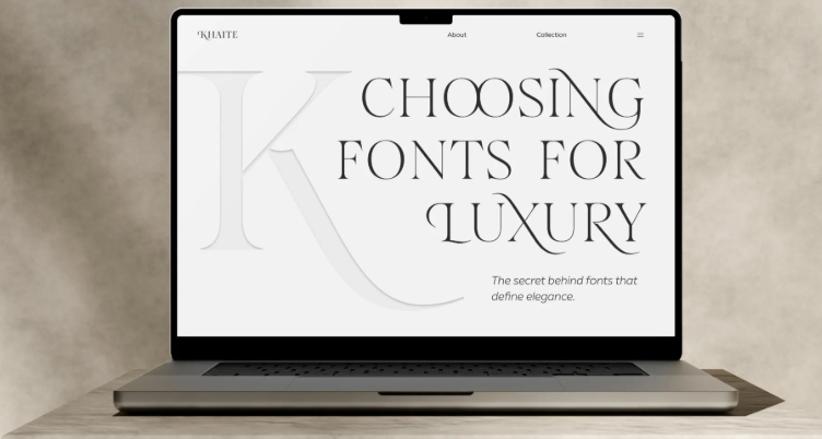
Then came Bodoni and Didot with very thin serifs. Their letters looked sharp, fancy, and fashionable. Luxury brands and magazines loved this style. It gave a feeling of class and high quality. This modern look is still used for high-end design.
Today, computers help us make serifs that work well on screens. Foundries like TypeType design serifs with clear shapes for phones and monitors. The look keeps changing, but the core idea stays the same. Serifs remain useful and beautiful.
See also: Key Factors to Consider Before Choosing a Ceiling Projection Screen for Commercial Spaces
How to Select the Perfect Serif Fonts for Your Project
Consider Your Brand Personality
Every brand has its own voice. Serif fonts help show that voice to the world. Old, well-known companies often pick Garamond or Caslon. These fonts feel honest and experienced. A new tech company might choose a sturdy slab serif. It feels confident but not too old.
Old Style serifs work great for schools and publishers. They look smart but friendly. Transitional serifs like Baskerville fit business reports. They mix respect with a modern touch. Always match the font to what your brand wants to say.
For luxury items, Modern serifs are a top choice. Their sharp style feels special and exclusive. Slab serifs can also feel warm and down-to-earth. Think about your customers and their feelings. The right serif builds a bond with them fast.
Always test your serif in different sizes. A font that looks nice in a big logo might be hard to read in small text. Balance style with daily use. Serif fonts are strong tools, but they must work for your readers first.
Pairing Serif Fonts with Sans Serifs
Mixing serifs with sans serifs can look really good. Use a serif for main titles to bring a touch of class. Then pick a simple sans serif for the main text. This contrast helps people understand what to read first. It is a common trick in web design.
Good pairs often share similar shapes or heights. For example, a classic serif works well with a clean sans. Try not to mix two very fancy fonts. Keep one simple and the other more detailed. Simple pairings usually look the most professional.
You can also swap the roles. Use a sans for titles and a serif for long articles. Many people find serifs easier on the eyes when reading a lot of text. On a screen, test both choices. The goal is clear and easy reading.
Look at other designs for ideas. Many font makers show suggested pairs. TypeType offers font families with both serif and sans versions. This makes pairing super simple from the start. Try things out, but listen to expert tips.
Legibility on Screens
Reading on screens is not the same as on paper. Tiny serifs can get blurry on some displays. Pick serif fonts that are made for screens. They usually have larger open spaces and stronger serifs. This keeps them clear on phones and computers.
Designers now make screen-first serifs that keep their charm. They keep small details but make main parts stronger. Always check your font on real devices. See how it looks on different systems. Small changes can affect how easy it is to read.
Computers handle fonts in their own way. Use web fonts with good settings for smooth edges. Variable fonts let you change weight for screens. A slightly bolder weight often reads better on bright screens. Test at small sizes, especially for notes.
For long text, stay away from very light or very bold serifs. They can tire the eyes fast. Also watch your line spacing and column width. Good design is more than just a font. A clear serif is a great start for that system.
Exploring TypeType’s Serif Offerings
TypeType is a modern font foundry with many serif choices. Their fonts mix old style with new needs. Each one is carefully made for screens and print. Designers all over trust them for their projects. Their serifs are both lovely and useful.
TT Norms Serif is a popular family from TypeType. It mixes clean shapes with warm serifs. The family has many weights and italics. It works well on websites and in printed reports. Its flexibility makes it a favorite among pros.
Another nice font is TT Hoves Pro, which has a serif version. It sits between classic and simple styles. TypeType also gives you variable font choices. This lets you control weight and size for any job. You can adjust it just right for your work.
Picking TypeType means you get quality and help. Their serif fonts are tested in real situations. Whether you need a text serif for a book or a bold one for a logo, they have it. Visit their site to find the right serif for your next design.
Serif fonts still play a big role in how we share ideas. Their long history and many styles make them useful for all kinds of work. When you learn about different serif types, you can pick ones that are easy to read and fit your brand. Whether you like old styles like Garamond or new ones from TypeType, serifs give you many options. Use these lasting typefaces to add depth and feeling to your work. They stay a strong tool for anyone who designs.
Conclusion: The Enduring Role of Serif Fonts
Serif fonts have lasted through the ages, from stone carvings to digital screens. They bring a sense of trust, style, and history to any project. By picking the right serif, you can boost your brand and share your message better. Foundries like TypeType keep making new serifs that work great online. As you start your next design job, think about what serif fonts can offer. They are not just letters. They connect the past with the future of design. Their lasting charm will keep inspiring new ideas for a long time.